Barilla Love — Reframing Pasta as an Emotional Ritual
Packaging Strategy | Product Innovation | Lead Design
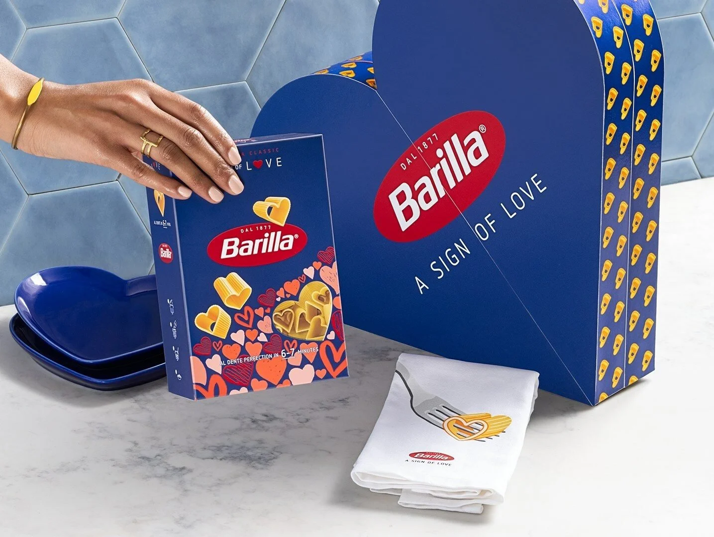
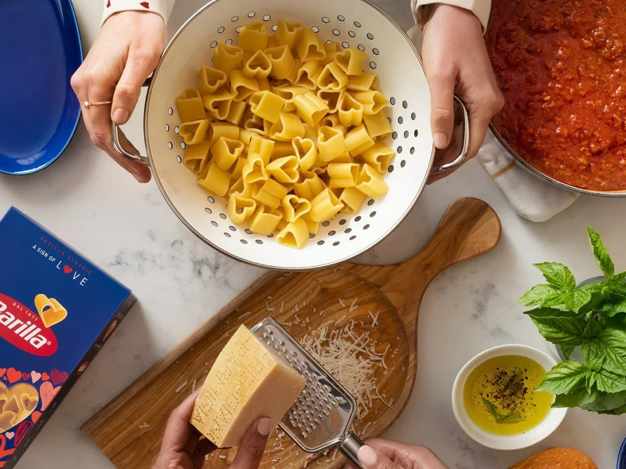
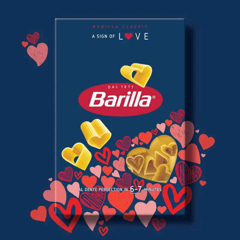
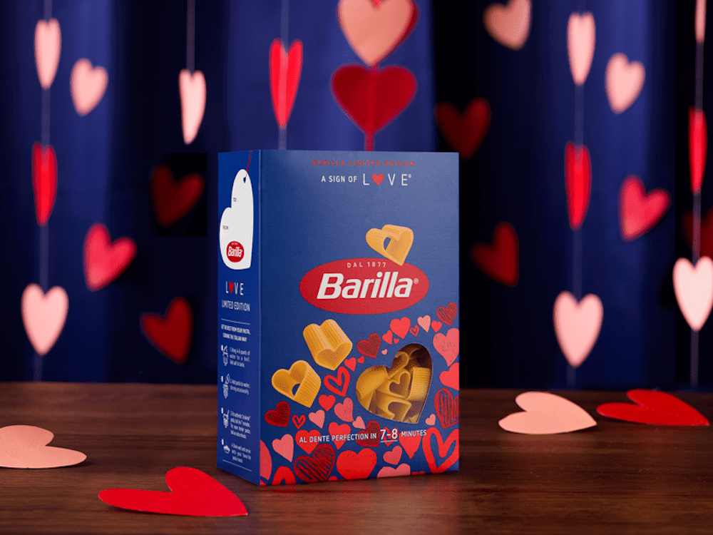
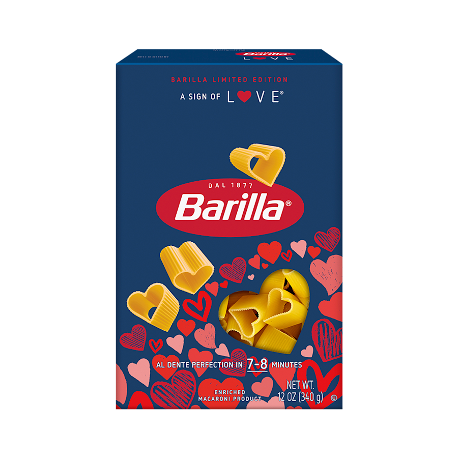
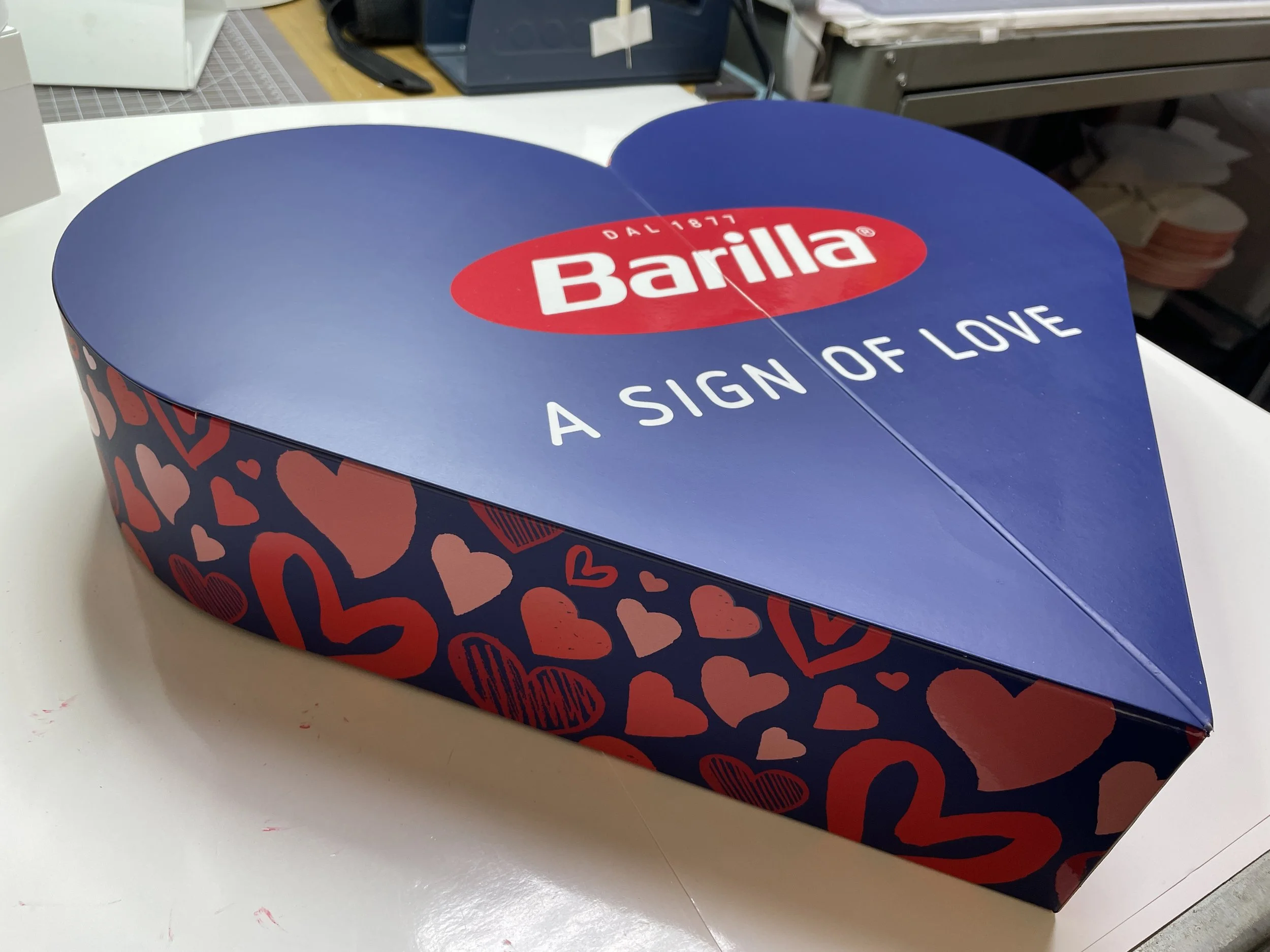
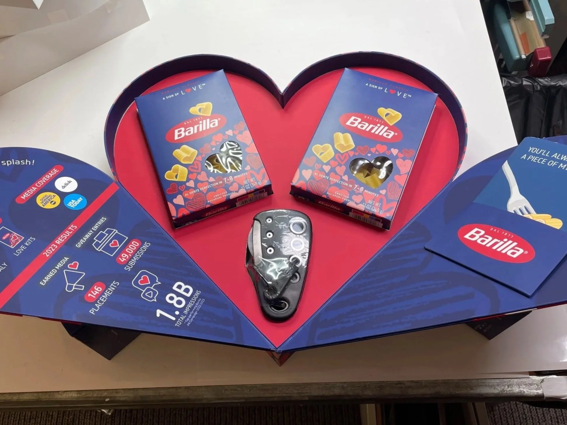
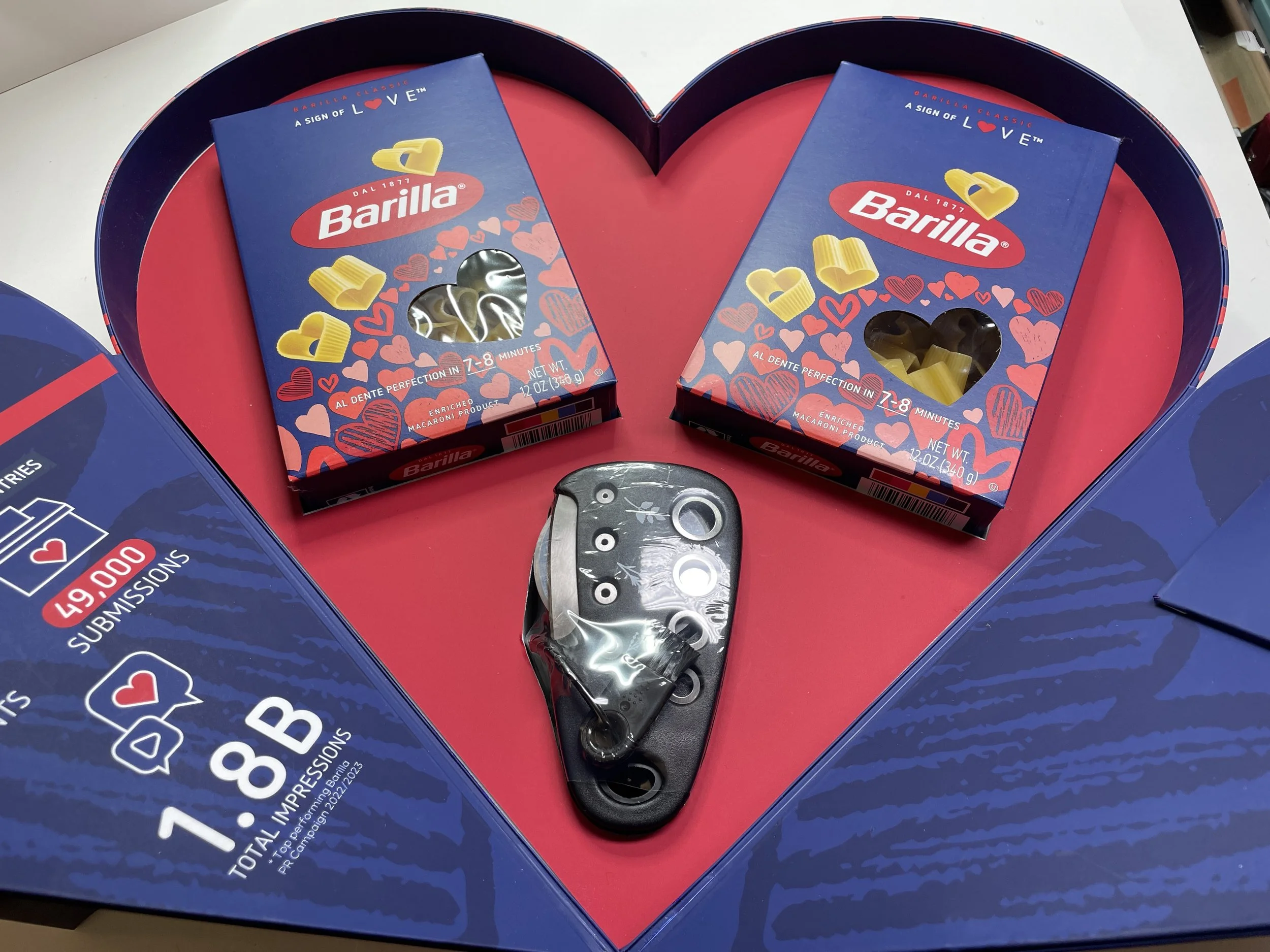
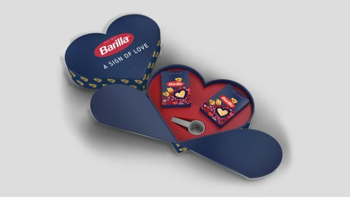
Barilla partnered with Kaleidoscope to develop a limited-edition packaging concept for Barilla Love, a seasonal, heart-shaped pasta created to celebrate connection through shared meals.
The opportunity was to translate a highly emotional product concept into a packaging system that could perform at scale within one of the most recognizable food brands in the world. The solution needed to feel distinctive enough to justify a limited-edition launch, while maintaining the clarity, trust, and consistency that define Barilla’s global presence.
CREATIVE TEAM: LIZ RESSE (SR. CD), TOM HERBERT (SR. STRUCTURAL PACKAGING MGR), & EMILY TUSKAN-TANNER (STRUCTURAL PACKAGING DESIGNER)
creating emotional impact at shelf
This project required navigating a structural tension between emotional expression and brand discipline.
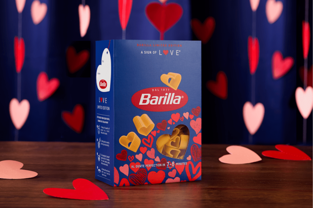
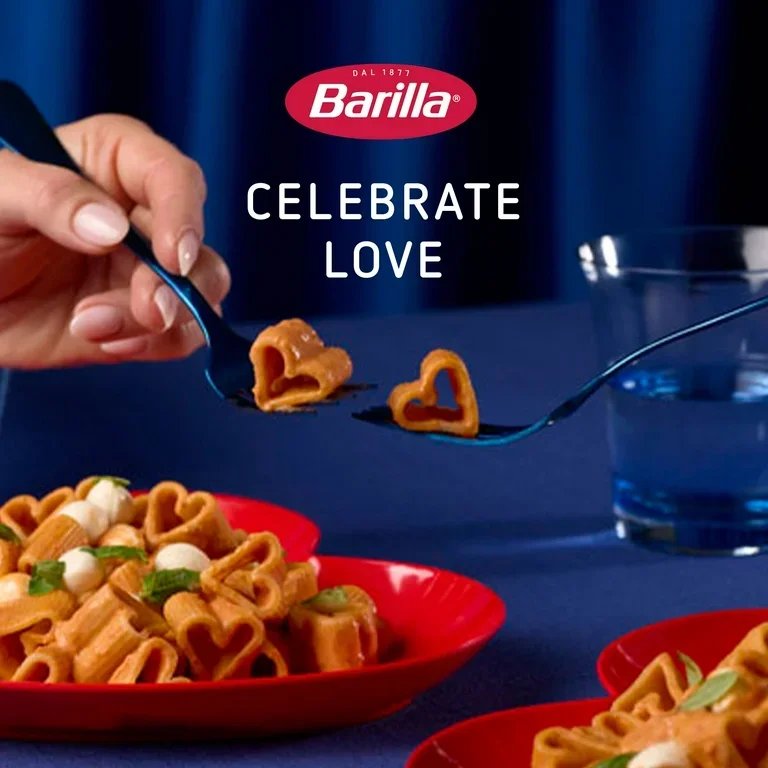
Barilla Love was conceived as a limited-edition, heart-shaped pasta designed to celebrate connection and shared moments. The product itself carried a strong emotional premise, positioning pasta as a gesture of love rather than just a staple food.
That premise naturally pushed the design toward a more expressive, celebratory visual language.
However, Barilla operates within one of the most established and recognizable packaging systems in the category. As a global brand with over a century of history and a dominant market presence, its packaging functions as a consistent trust signal across markets.
Every element, from color to hierarchy to composition, is part of a tightly controlled system designed for instant recognition at shelf.
A constrained design space
This created a narrow and highly sensitive design corridor:
Lean too far into emotional expression
→ the packaging risks feeling decorative, novelty-driven, or disconnected from the Barilla systemLean too far into brand consistency
→ the product’s distinctiveness is diluted, reducing its effectiveness as a limited-edition launch
The challenge was not choosing between these extremes, but identifying a precise point of calibration where both could coexist without undermining each other.
Framing the Problem
I approached the project as a process of actively managing how far the Barilla brand could stretch without losing recognizability at scale.
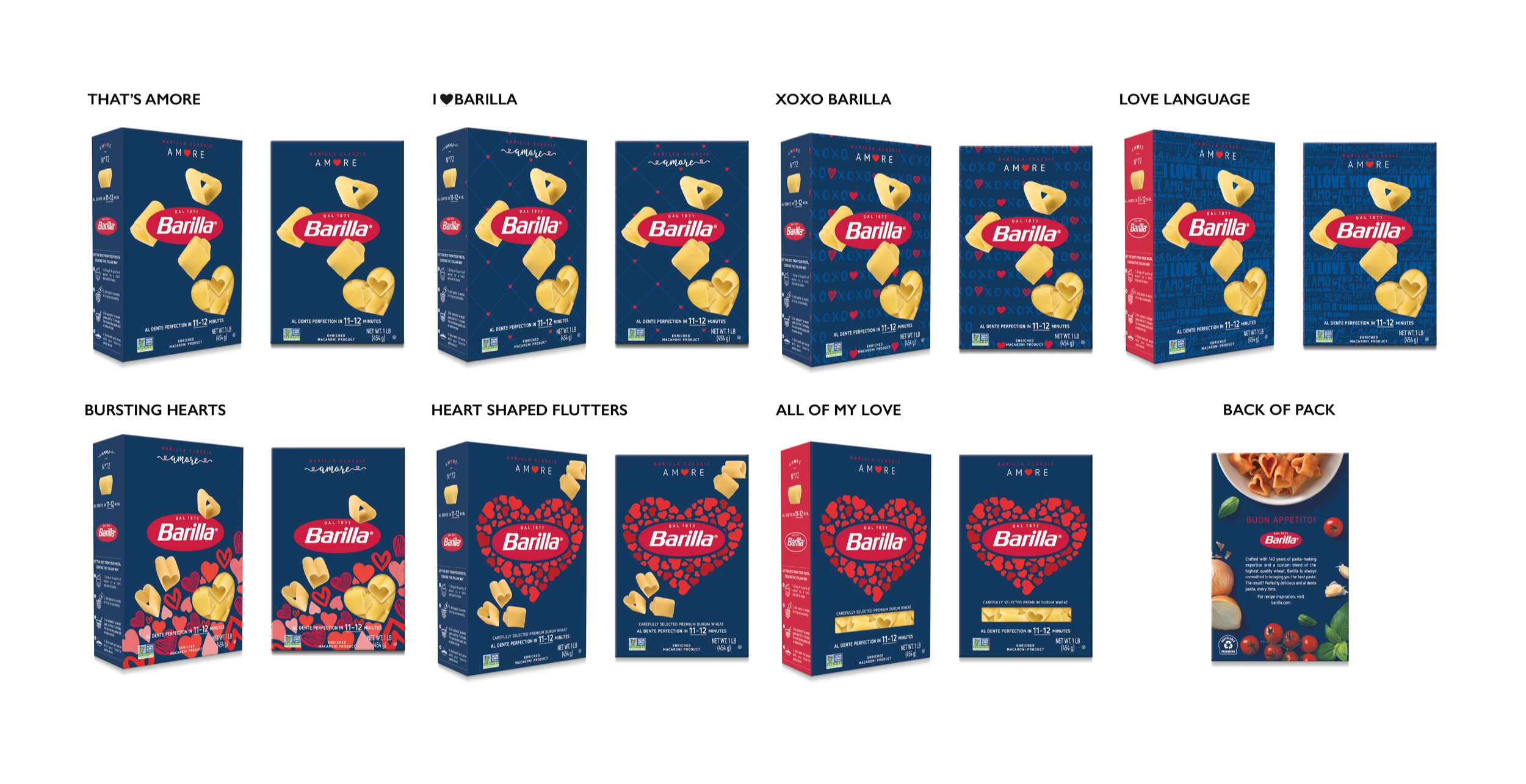
Rather than starting from visual exploration alone, I defined a decision framework upfront to control how each concept balanced emotional expression against brand fidelity.
Each direction was evaluated against three criteria:
Emotional immediacy
Does the concept communicate “love” instantly, without requiring interpretation?Brand integrity
Does it preserve the core visual signals that make Barilla recognizable in a retail environment?Differentiation at shelf
Does it create enough contrast from the core portfolio to justify a limited-edition launch?
This framework ensured that decisions were made deliberately, not reactively—allowing the work to evolve while staying anchored to the brand system.
“Barilla Love” reimagines pasta packaging as a gesture of care, intimacy, and shared experience.
Exploration Strategy
Several factors intensified this tension beyond a typical packaging exercise:
Brand equity at scale
Barilla’s packaging is not just a visual system, it is a trust signal built across global markets. Even minor deviations in hierarchy, color balance, or composition can impact recognition and perceived quality.Ambiguity of the core theme
“Love” is inherently broad and subjective. Without careful control, early concepts risked becoming overly literal, overly abstract, or tonally inconsistent with the brand’s established voice.Temporal context of the product
As a seasonal, limited-run release, the design needed to feel immediately differentiated on shelf, while still belonging to a long-standing product ecosystem.Compressed timeline and iterative rounds
The work progressed across multiple rounds within a constrained timeframe, requiring rapid expansion of ideas followed by equally decisive convergence.Stakeholder alignment across levels
Concepts needed to resonate not only creatively, but also with internal brand stakeholders responsible for maintaining consistency across a global portfolio. Each direction had to be both compelling and defensible.
Freelance — BluEdge
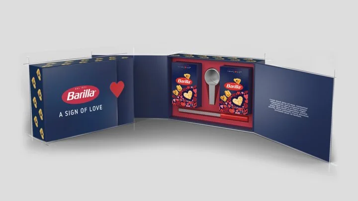
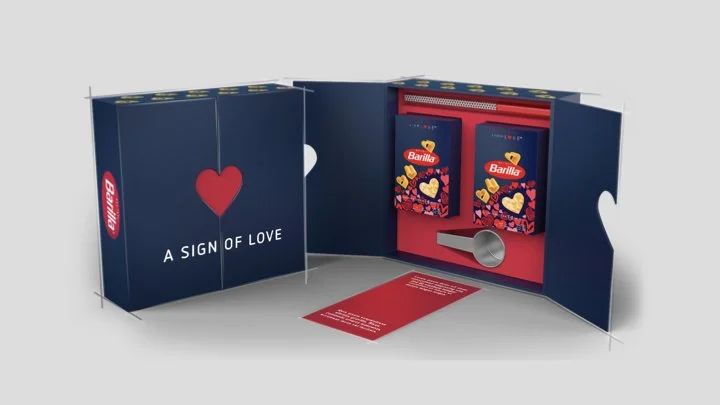
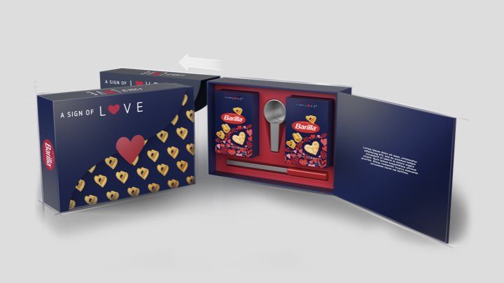
retail Mailer Kits
For National Chain & Key Accounts
3d render ideations